
It is no secret that we love infographics. We’ve featured tons of great, interesting ones. However, this one below, attributed to the 500 Startups crew,may be our favorite infographic to-date. It is both visually beautiful, and incredibly informative.
“The Origins of Common UI Symbols” is, at least in my estimations, the perfect infographic. It covers a very interesting topic in a great amount of detail, and is beautifully minimalistic. Who knew that these symbols, which have become an everyday part of modern life, had such a rich and storied history? The best UI/UX, it has been said, is one that you don’t even notice. Perhaps that is the reason that the origin of the common UI symbols are often hidden, really for lack of looking. By going unnoticed, these UI symbols adhere to the guide of a good UI. So, in effect, the infographic is an embodiment of the very topic with which it is concerned. Maybe I am romanticizing a bit, but who cares? Did you even read this? Probably not.
Anyhow, without any further ado, feast your eyes on the beautiful “Origins of Common UI Symbols” our favorite infographic to-date:
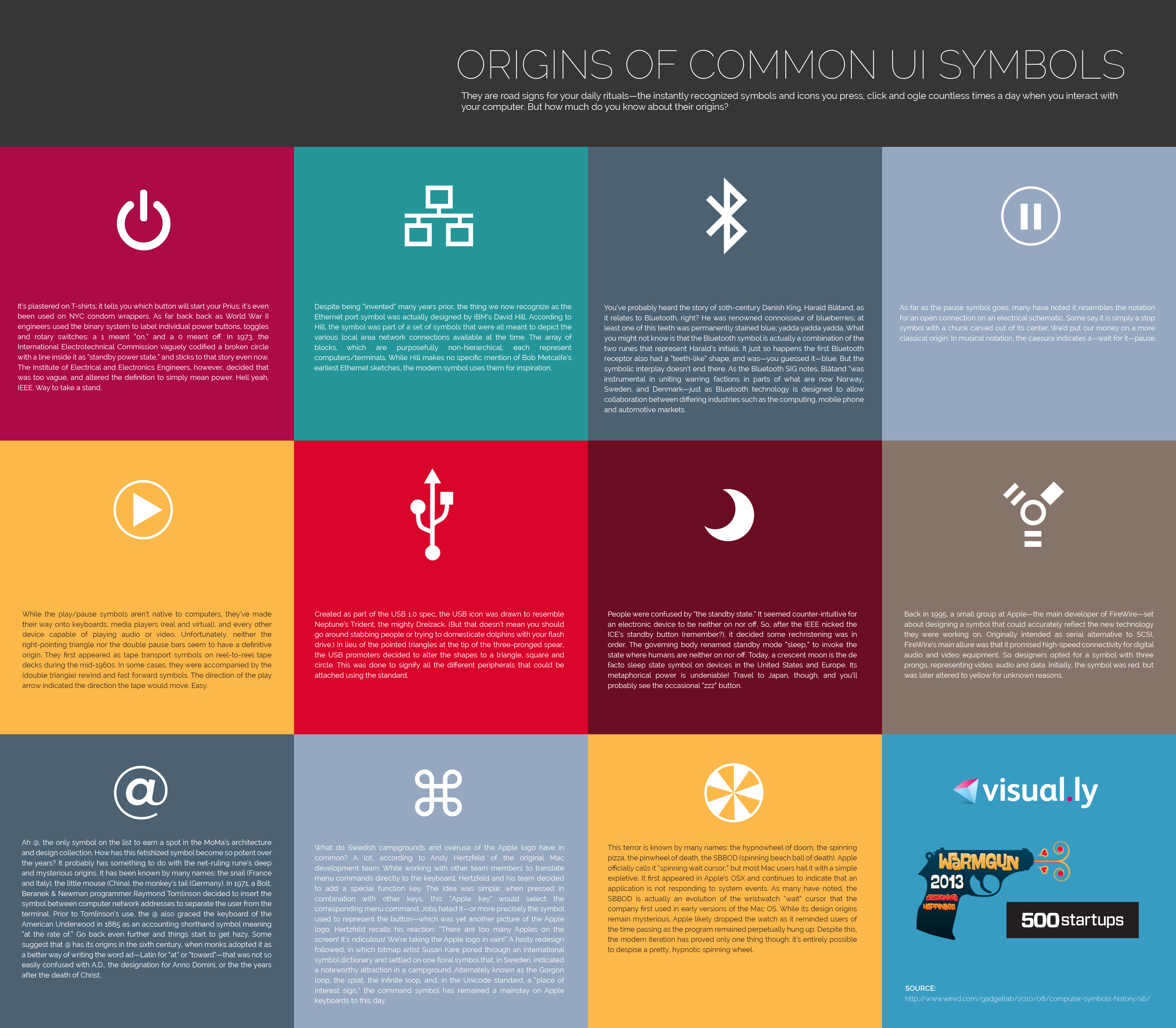
Via Visual.ly