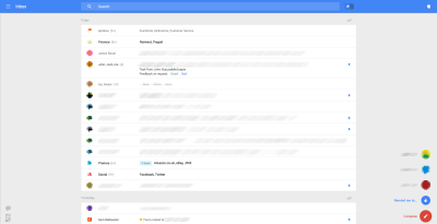
 The “Do no evil,” slogan is contained in Google’s guiding “Ten things we know to be true.” Included in these ten things is number two, “It’s best to do one thing really, really well.” Now this is not some sort of examination of Google philosophy, or some such thing, but rather a look at one of these things they do really well: email. Google has been in the email game for more than ten years, but you would hardly know. Look at this UI from in 2004:
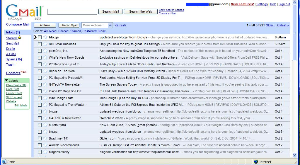
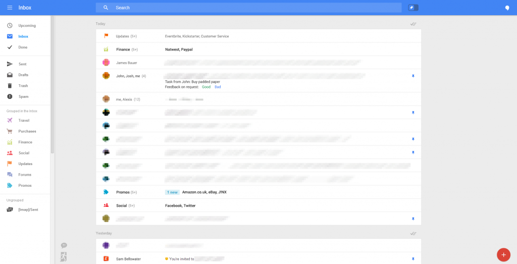
A bit different, but this 10 year old screenshot is strikingly similar to the current Gmail. More-or-less, the Gmail web client has remained a constant. The tabbed email experiment, was just about the only major shake up over the years. However, the guys over at Geek.com were shown a radical new Gmail UI: “The wave of features we’ve been invited to take a look at shows an entirely different user interface, one that is clearly designed to function across a variety of screen sizes without losing functionality.”1 Indeed. Take a look at these images:
Via Geek.com
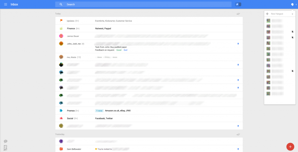
This new UI is shockingly minimalist. While there is still the sidebar, as the images below show it is hidden by default. Google, it appears, is stripping away everything, leaving you with the essence of Gmail, the mail itself. Along with the standard menu bar – left in the image above – Hangouts are also represented in a collapasable menu on the right hand side:
Via Geek.com
This represents the largest redesign of Gmail ever. It remains to be seen when, and even if, these features will be released. But I, for one, and hoping it’s soon.
- Russell Holly, Geek.com, “Google is testing new web-based Gmail features,” May. 9, 2014 ▲

