 If you’ve been with Android since the beginning you’ve seen their app store go through a plethora of changes. Of course the most significant was the change from Android Market to Google Play. But over the past two years or so, the Google Play store has looked pretty much the same.
It’s a functional online marketplace for Google’s content for Android devices. Like it’s Apple counterpart there are plenty of screen shots (if not more than Apple), reviews, descriptions and everything you need to know about that new app. But aside from the screenshots the walls are pretty bare.
That’s all changing now.
Androidpolice.com broke the story early last week that the Google Play store was going to have a significant makeover. The makeover was to include a lot more images and an overall better look aesthetically speaking.
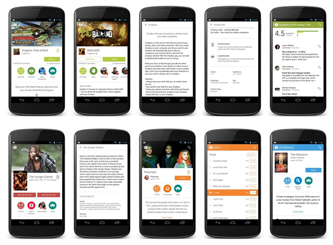
Now engadget reports that the new Google Play store is starting to roll out for both Android phone and Android tablets. They report that at first glance it’s not that big of a change but going deeper into apps themselves the cover art takes a bigger role and both app details and reviews have been moved into easy to read icons.
The changes also include new animations, new badges and new headers for videos included in the app description.
The new version of the Google Play store was first introduced to Android developers last month at Google I/O and it’s considered “heavy on the Material Design”.
If you’re an Android user you should start seeing the update anytime now.

