


Yahoo! unveiling its new logo, combined with the below tweet from The Verge’s Chris Ziegler got me thinking about logo transformations. There have been some awful changes, but what about good changes?
hmm… FedEx maybe? RT @harrymccracken: I’m not sure if there’s such a thing as a new logo that’s better than the one it replaces.
— Chris Ziegler (@zpower) September 5, 2013
The Good
FedEx
The aforementioned FedEx logo, via DiginDigin
The FedEx logo update is an example of just that, an update. They took an old and uninspiring logo and turned it into a sleeker, more modern one, with a hidden arrow.
Firefox
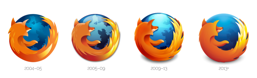
The Firefox update was a practice in simplification. In fact Sean Martell, Mozilla’s lead designer said of the logo, “Not a logo redesign, but a simplification in form and function.”

Twitter’s redesign was another simplification. The transformation seems to illustrate Twitter’s maturation as a platform.
NFL LOGOS
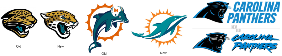
It seems that just about every year another NFL team updates its logo. The Jaguars, Dolphins, and the Panthers seem to have done a pretty decent job.
The Not So Good
The Miami (Née Florida) Marlins
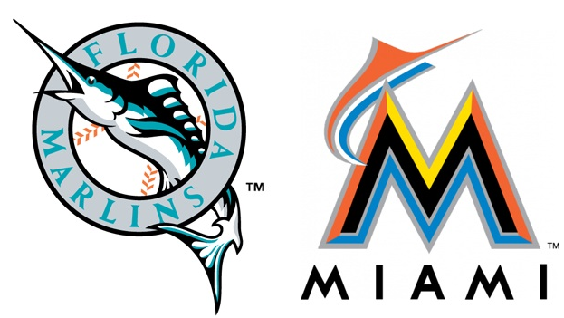
The Marlins take the cake. The logo is a great representation of Jeffrey Loria’s management style, clown-like.
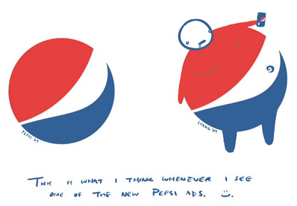
Pepsi
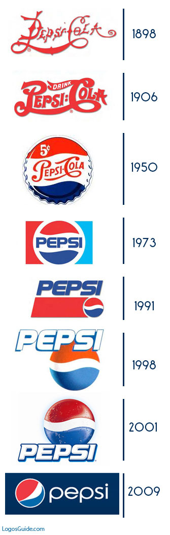
This is not to say that all Pepsi logos have been bad, just the most current logo. Every time I see the logo, I am reminded of the Lawrence Yang drawing below:
USA Today

Via The Fi Blog
There are many, many more terrible logo redesigns out there. What has been your favorite or least favorite redesign?